Colour Search Engine Design: Designing for Colour Comparison
This is a series of notes on colour search design based on my experiences desgining search interfaces for the lipstick search engine lipcolourmatch.com. I will link other parts of the series here as they become available.
Simple yet flexible: the design of the query page
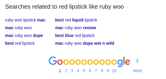
The initial design of the lipcolourmatch.com search interface drew heavy inspiration from the relative minimalism of the Google search engine front page, which has a graphic, a search box and a few buttons as the main features.
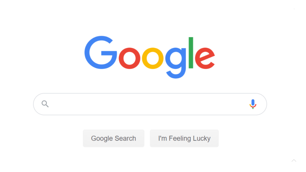
The design of Google’s text-based search engine is minimal.
However, one of the reasons that such a scarcity of elements works for Google’s usecase is that text search is a good deal more simple than the search interface of a niche colour search engine. Not only does the UI designer need to provide a suitable UI element for choosing colours, this UI element also needs to account for the various textural subtleties that a user may desire to search for.
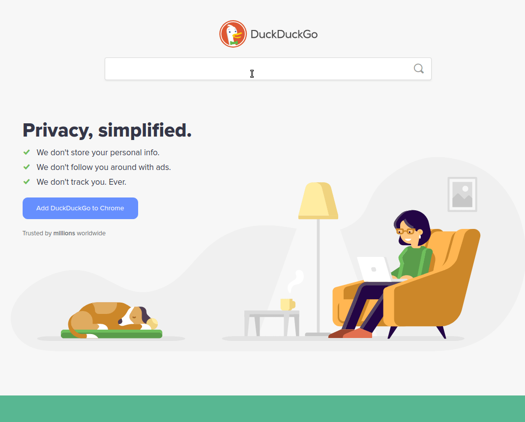
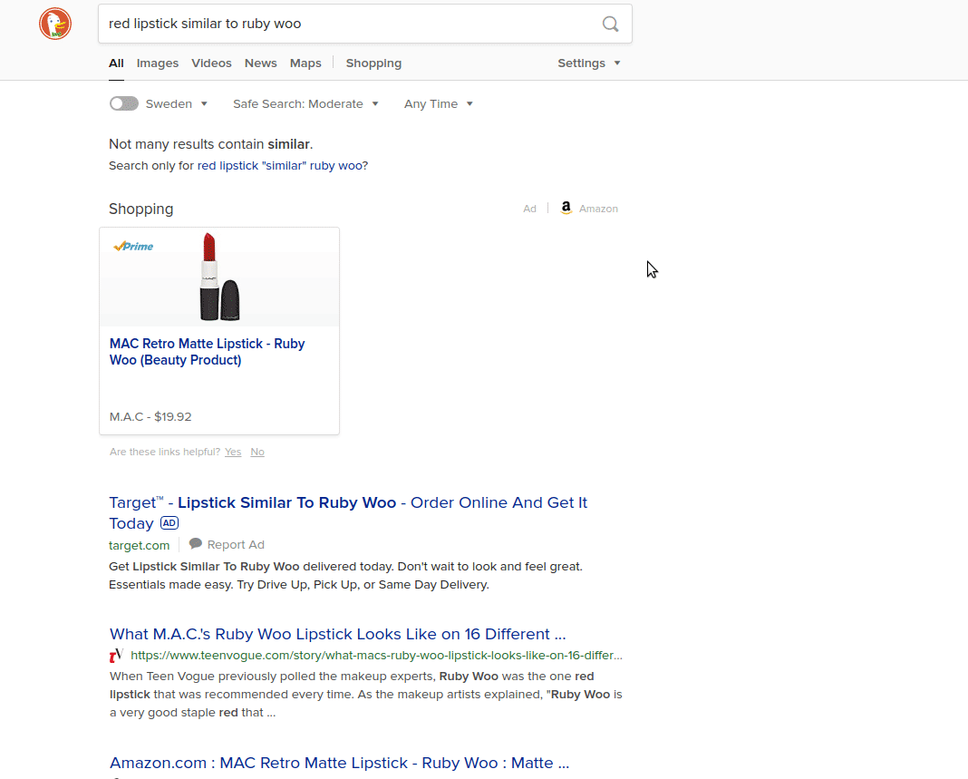
DuckDuckGo features a minimal search bar.
In the case of lipcolours, a product has variation not only in the shade, but also in the finish. The same colour can appear as metallic (the formula has a added element for high shine and reflectivity), shimmer (the formula is shiny with tiny sparkles), cream (not as shiny as metallic, but more reflective than matte) and matte, which is usually the most pigmented and least reflective form a lipcolour. These variations in texture need to be taken into account in the search query.
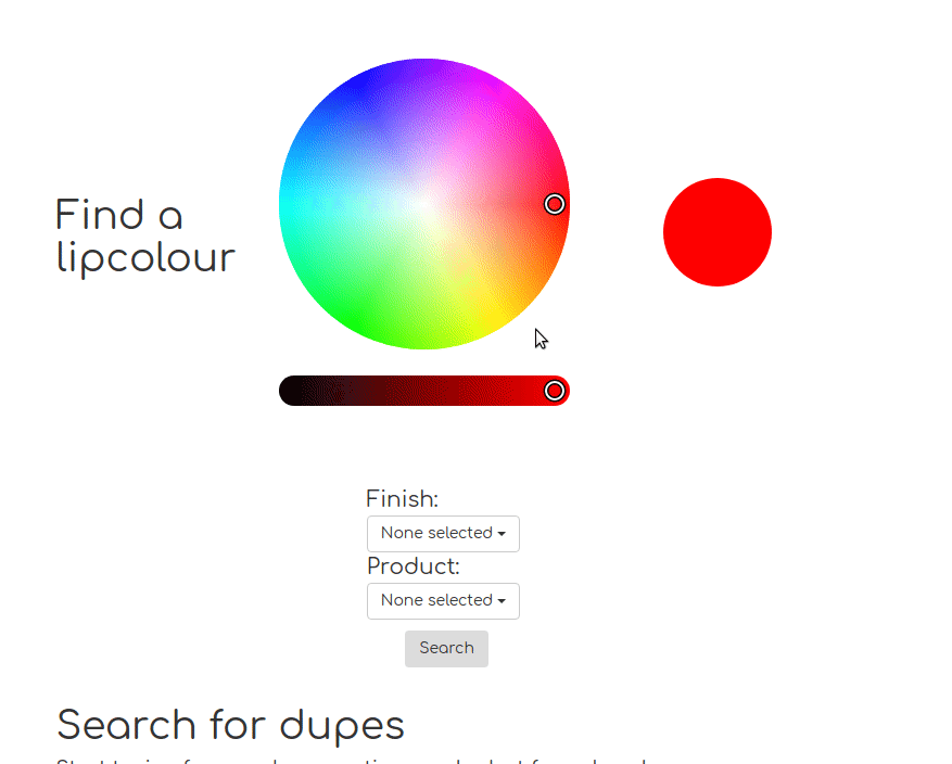
Searching for a lipgloss in a particular shade on lipcolourmatch.com
To capture this complexity (the solution described here is not perfect by any means and will certainly require more iterations), the initial colour search UI design for lipcolourmatch.com featured a colour wheel selector powered by the open source library iro.js and a drop down control for adding desired finish and product type filters. For example, one could, if desired search for lipstick and liquid lipstick products in a matte navy blue colour.
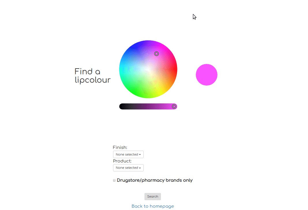
Searching for navy blue lipsticks and liquid lips in a matter finish.
Displaying the search results
The next important step in the design of a colour search engine is the format of the results. The initial inspiration was once again drawn from the world of text based search engines where web pages that best match a user’s query are listed in descending order. Some search engines like Google paginate the results, while others like DuckDuckGo offer an infinite-scroll-lazy-loading experience.
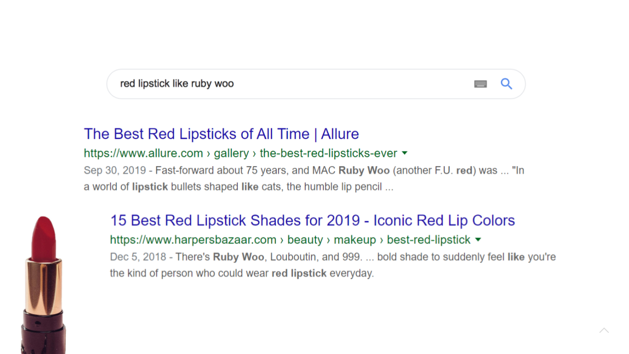
UI design for paginating search results on Google
As the user scrolls down, the backend returns more and more results.
DuckDuckGo pagination is an infinite-scroll.
In addition to the results, the results pages of search engines usually also display the original query, to help the user see what they searched for and how well what they found with the help fo the search engine matches what they searched for.
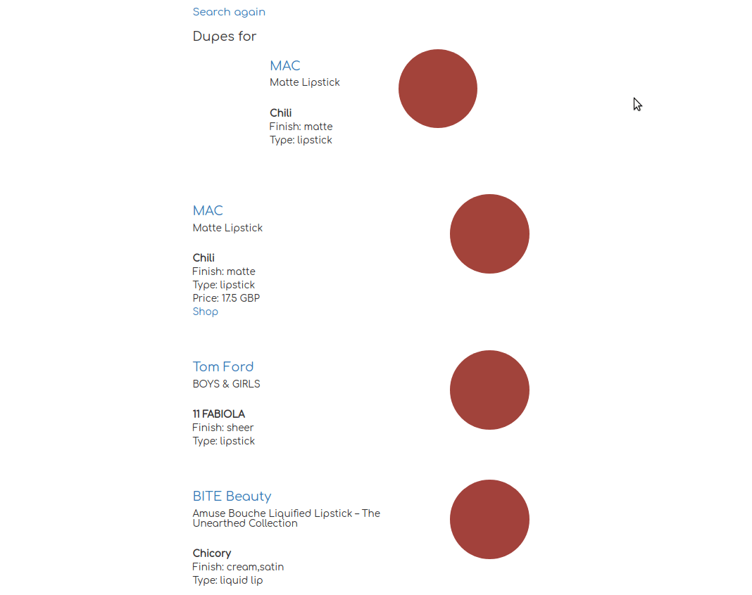
The initial design of the colour search engine results followed the template above fairly closely. The results page features a “You searched for” section that shows a coloured circle featuring the colour the user chose from the colour wheel on the main page and then a list of results in a descending similarity order. The closest colours (according to the colour search engines similarity metric) are listed first.
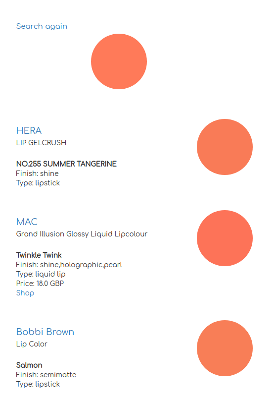
Search results from the colour search engine feature the original query, the results in descending order of colour similarity as well as small cards with information.
Each search result is displayed with a small card that has a circular colour element that captures the colour of the product. In addition, each card has information about the brand, the product type and the finish.
Grid-like results to facilitate comparison
One key task a user wants to do is to compare the results with the query. This is farily simple with a text search engine but harder when the query is a colour.
One of the main tasks that a user is interested in doing is comparing the colour in the search query to the colour of the items returned in the results to see how close the matches are to the query. Thinking back to the results page of traditional text-based web search engines, we can see that the pagination design (whether it’s a traditional pagination UI or an infinitely scrolling UI) does not interfere with the process of comparison that a user engages in. We take the query we entered into the search engine and then scan the results checking which one could potentially have useful information related to the query. It’s relatively easy to keep a text query in mind, so the paginated approach does not pose a major hindrance to the user’s goal of comparing the query to the results.
Paginated search results from the colour search engine. Keeping the exact query colour in mind and paginating to compare results can be hard.
However, keeping the exact shade of a colour (the colour in the query) in your mind and then scrolling or paginating through each result card and comparing the colours is challenging. You can see for yourself in the animated screencapture above.
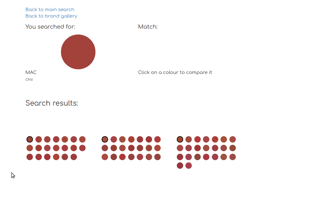
A grid design facilitates colour comparison.
One solution for this would be to dock the “You searched for” card at the top of the screen while scrolling and thus facilitate quick and easy side by side comparison. However, for the time being implementing this with the Bootstrap framework proved too difficult, so instead I’ve opted for implementing a grid of results with a side by side card arrangement that displays the queried colour on the left and allows the user to populate the card on the right with a search result from the grid.
I will be iterating more on this design in the near future and look forward to sharing what I learn with you! If you have any comments, suggestions or questions, please get in touch with me via email camilla[at]synbyote.io.